Marketing by Color: Don’t Try To Sell Blue Potatoes
 The colors you use for your logo, your business card, your web design and even your storefront display influence consumers – sometimes very strongly.
For example, what colors do you associate with a spooky night? Most likely, you’ll choose black, shades of gray and maybe a little silver or even orange. Haunted evenings generally don’t come in vivid blues and fresh greens, after all.
Here’s another example: Think about Coca Cola. What color jumps to mind? Most people choose red, because Coca Cola has associated that color with their brand image. Their logo is red, their cans are red and everything about the soda giant seems to be red.
You would most likely wince if you tried to associate the color green and Coca Cola together.
Read more to find out how you can use the power of color psychology to your advantage.
The Power of Color
Color psychology exists, and it’s a fairly complex field of study, too. It looks at which colors we prefer and why. It explores color and memory recall. It examines the impact of certain colors on both our physical and emotional state.
Harveys fast food restaurants, for example, use orange in their color branding because orange often stimulates appetite. Banks like to use blue in their themes, because people prefer blue over most colors and also because blue is commonly associated with trust and security.
When building your startup business or when considering an image overhaul of an existing business, put thought into color palettes and selections that will help your brand image. Mismatching color and brand can actually influence consumer perception in a negative way and cost you sales.
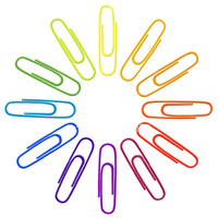
Trying to Sell Blue Potatoes
Here’s another example: everyone knows what a potato is—a root vegetable with white or red skin. We mash them into white fluffy clouds, slice them into scalloped casseroles and grate them into patties. We know that potatoes are white inside.
Enter the blue potato, a fantastic variety that mashes, slices, bakes and fries just as nicely as its snowy counterpart. It even has possible antioxidant potential.
To a certain enterprising company, this seemed like a lucrative business opportunity.
Did blue potato sales skyrocket? No. Did people rush to the stores for blue potatoes? Nope. Did the blue potato become a household staple? Nope. If it weren’t for their novelty factor and a few cooks with exploratory minds, these potatoes would never have sold at all.
The reason is that people don’t associate the color blue with potatoes.
In fact, they may go so far as to perceive blue potatoes as tasting bad, being inedible or even being poison for human consumption. The notion of a blue potato is so foreign that consumers don’t embrace the blue potato at all.
Do you want your business to become a blue potato?
Associated Meanings of Color
Spend some time thinking of potential color choices that reflect the emotion that you’d like people to have when they see your brand image. Color can have strong emotional impact that heightens the selling potential of your product or service.
Color can help memory recall as well. When you’re hot, thirsty and want something cold to drink, your memory of a color association might make you reach for that red can of Coke and pass over other brand names you don’t recognize easily. You remember that red means Coke.
Likewise, your company colors can help people remember your product or service and choose you over the competition. The specific colors you choose enhance the feelings a person has about your business, too.
To help you think of good colors for your logo, your web design or your business image, here are some common colors and their associated meanings:
Red – Energy, attention, passion, danger, debt, halt
Blue – Trust, security, peace, open, stability
Green – Freshness, growth, vitality, calm, wealth, prestige
Yellow – Light, optimism, motivation, warmth, positive
Purple – Sophistication, royalty, sentimentality, mystery, spirituality
Pink – Energy, fun, youth, excitement, affection, romance, sentimentality
Orange – Fun, vitality, youth, health, exuberance
Brown – Stability, earth, durability, dirty
Black – Power, class, seriousness, drama, sophistication, boldness
White – Purity, peace, cleanliness, freshness
A good rule of thumb is to choose one dominant color and only one or two accent colors for your logo or brand image. Accent colors should complement the main color and enhance its appeal as much as possible. Use them sparingly, as they should be secondary elements of the impact.
With a good choice of color, you can build a more effective image for your business and enhance your marketing potential - unless you want your business to be like blue potatoes, of course.
<em>Author’s Note: Color meanings are not universal. Culture, events, industries and more affect the way we associate meanings with color.
For the purpose of our target audience, this post focuses on American culture.</em>


Reader Comments
That is an excellent point about the power of color. I ran into an inadvertent illustration of this point a couple of days ago in the grocery store.
There was a rather large display of glass Mountain Dew bottles. Unfortunately, I didn’t even know it was Mountain Dew until I looked closely because the bottles were all painted red white and blue. (Presumably left over from the 4th.)
I’m a Mountain Dew junkie, and ordinarily would have been inclined to buy a bottle or two, but the color scheme just put me off. If it’s not green, it’s not Mountain Dew.
Good point, Jarkko, and exactly. I’m consistently amazed at how little thought goes into color selection - and it really does matter a great deal. Color taps into our senses in a way that nothing else can.
Mountain Dew should be green, by the way, I agree.
Thanks for the list of color associations - I was just about to add a few new buttons onto my blog and this gives me some good food for thought.
It’s quite flattering to be mistaken for Jarkko. :-)
Doh! I’m sorry.
Actually, I’ve been struggling to separate the two of you in my mind since day one. I “met” you both at the same time, your name both starts with J, and you tend to have similar styles.
You’ve become a duo, my friend hehehe
No problem, James. I found it amusing. :-)
I agree that Jarkko and I tend to have similar styles.
<a >Referencement</a>, Agence de Referencement.
I tend to go for more business-like blues. I agree, they do tend to reflect trust.
o go for more business-like blues. I agree, they do tend to reflect tru
Although I never thought of it, you are so right! Colors really affect the way your brand is seen by customers. i was just reading these colors you listed and their meanings, and kept thinking how obvious it was so far.
hah, nice piece of advice! Too many companies chose a black business card when they’re into gardening for example, or choose a fancy design when they have a kid’s toys online shop.
If you have advance purchase a burial plot, you might want to consider gifting this to the family. This is the largest cost that people will often face and it can mean the difference between having a place of interment and being forced to cremate the body, even if this goes against the best wishes of the family collectively.
U.S. savings bonds and notes come in several varieties and denominations. With regard to college funding, Financial Aid Officer (FAO)s view these as assets. Just as important is the FAO’s perception of the interest that accrues on your assets, Kalman Chaney, best selling author of “Paying for College Without Going Broke” says
Hair color correction is a big money maker in salons nationwide.auto loan calculator with tax
Boutique hotel destination trends can see major variations recently as a consequence of increasing selecting demand. This is just because that the savvy of missed are opting for these hotels as a consequence of personalized service offered by them. Naturally, when they can be paying capital, they come to feel good every time they are pampered on the holidays and also business travels. asia boutique resorts
If there’s no backlash for not being healthy, then people will feel they can do as they please and people will and must accept it.Watercolor Paintings for sale
Should you have improve buy a burial plot of land, you may need to look at gifting that towards spouse and children. This can be the greatest price tag that people will frequently face plus it often times will be your distinction Disability insurance Lawyer concerning which has a place of interment and also having to cremate the body, whether or not that is going contrary to the greatest wants in the spouse and children with each other.
This is such a great information for me, because i do an online job thats why i need fast Internet connection, i search how to bost internet speed then ireach at a right place cigs coupon codes
Great observation and points. You are getting a best conversation rate of the bloggers and keep it in a simple way.
thebanecoat
Putting together a physical portfolio can be a great way to market your small business.192.168.1.254
忘れがたい2014のシャネルの中国海の帆船試合(Rolex China Sea Race)の中で、2人シャネル激安高齢の選手は気をつけないでつ新聞の第1条に上がって、1面喝采を勝ち取りました。
宝刀の古くなっていませんシャネル激安すでに87歳。彼はシャネル帆船試合(Rolex Sydney Hobart)まで(に)45期のロレックスのシドニーに参加したことがあってことがあって、勝ち取って1971年にロレックスの法斯特は特に帆船試合(Rolex Fastnet Race)のチャンピオンに耐えて、5回はアメリカの杯の帆船試合(America’sCup)に参加して、シャネルこの試合の体積を運転して最大で、スピードのもっとも速い帆船Ragamuffin90番が一挙に線のチャンピオンに突き進みを獲得しのでことがあります。シャネル時計コピー74歳のNeilPrydeは1人が60年の試合経験の帆船の選手を持つのです。彼は自分のあの身長の52フィートのHiFi号を運転していて、4年内の第2回絶対的な優位で今期のロレックスの中国海のシャネル帆船試合の冠を勝ち取ります。もしも1988年のあのシャネル優勝と計算して含めて、シャネル激安がこの試合の初になって3回が勝ち取るでしょう分けていつもチャンピオンのかじ取りを競いを譲ります。
Every kind of business got his own characteristics that compose theirselves into a color or a group of colors. A small example for a clothes shop: blue clothes don’t fit to little girls more than boys, so try to get a unique color for your categories, somethings to impress. You can guide yourself by the season, or holiday, or fest, anything, change them frequently.
Add Your Comment